Georgia O'Keeffe Museum
Evaluating Georgia O'Keeffe's Collections
Website To Provide A More Intuitive Experience
Usability Evaluation
Background
This case study was conducted to assess the usability of the desktop version of The Georgia O’Keeffe Museum Collections website and address any key concerns that may bring confusion to its users.
A series of six tasks were completed by our participants by navigating the website. The tests we conducted have provided great insights into the various usability problems that were encountered.
My Role
Usability Evaluator
Moderator & Observer
Building Recommendations
Designing Mockups
Skills
Usability Evaluation
Duration
7 Weeks
Tools
Figma, Miro
Our Team
Our Process
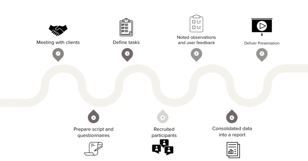
Meeting with Client
Understanding Client Goals
In order to conduct a usability evaluation for Georgia O’Keeffe’s website, It was important that we first understand the client needs and goals. Understanding from our client what Georgia O’keeffe’s legacy meant was of utmost importance to us to started on our project.
Preparing Questionnaires
Screening Questions
Gaining insight of into our users
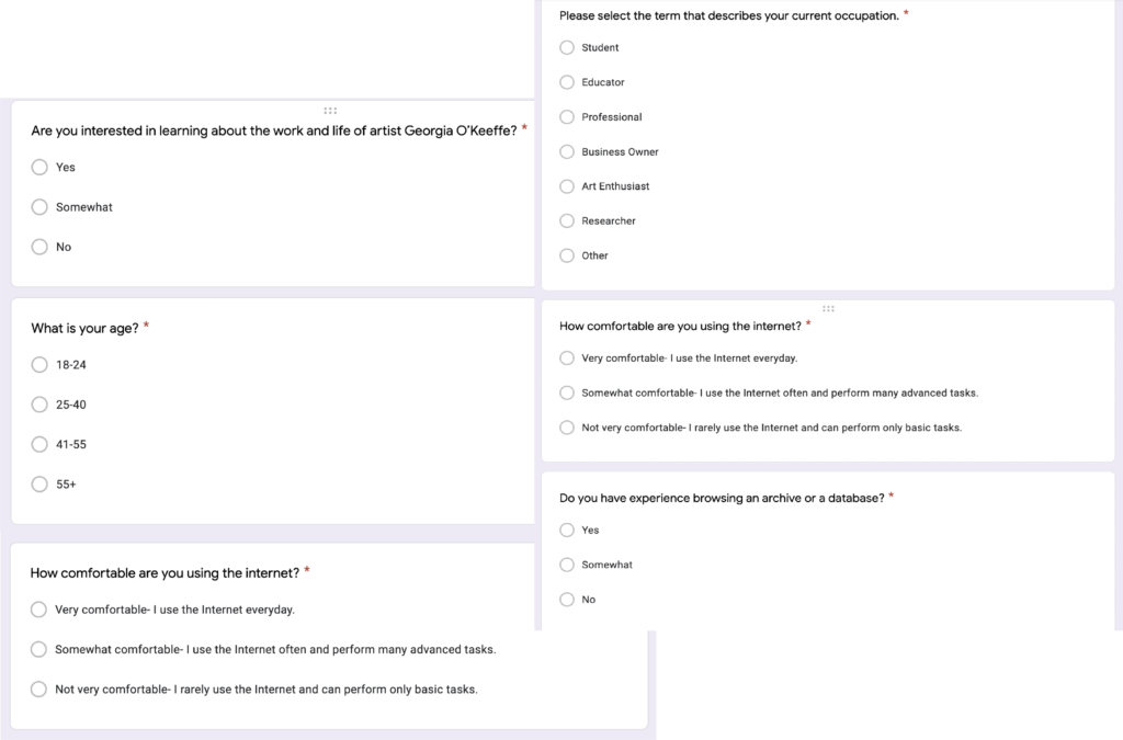
In order to further define our tasks and scenarios, we needed to understand the kind of users we are looking at. The intended user of the Georgia O’Keeffe Museum Collections Online website is someone who has an interest in the life and works of Georgia O’Keeffe and would like to use the website as a research tool to explore how the two intersect. The screening questions would help us in identifying our target users.
Preparing Questionnaires
In order to filter through our pool of participants, we devised a pre -test questionnaire which would help us in understanding and identifying our target audience.
Defining Tasks & Scenarios
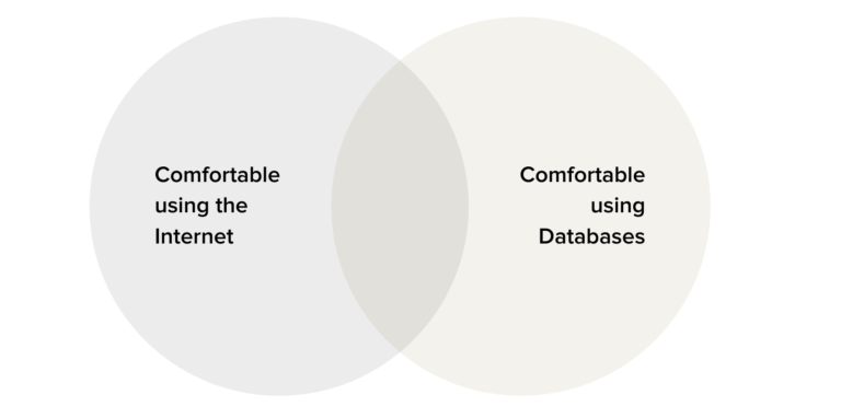
Our Target Users
Hence, we focused on users who overlapped in the areas:
Defining Tasks & Scenarios
Research Outcome
Defining tasks & scenarios
Developing Tasks For The Users
Keeping our target audience in mind, we started with the process of developing tasks which would cover Georgia O’Keeffe’s artwork, archives, her personal belongings as well as her personal collection.
The idea is for users to explore the extensive collection which also gives us the opportunity to cover a wider range of aspects in case any usability issues are encountered.
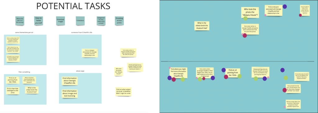
The following scenario was provided to the users which gave them a background to perform the tasks.
Scenario: Imagine you are interested in writing a research paper on the life and works of Georgia O’Keeffe, and want to use the collections website to find out more about her and examples of her work.

Follow up questions were asked to the participants in case they wanted to elaborate on survey responses:
Do you think we missed anything? What’s one question we should have asked you during the test?
What did you like most about the website? What did you like least?
- If you could change one aspect of the site, what would it be?
Recruiting Participants
Conducting Moderated User Testing
Our pool of participants consisted of a mix between researchers from the Georgia O’Keeffe Museum and individuals unaffiliated with the museum in various fields including students, educators, and working professionals.
We conducted Moderated User Testing and recorded sessions for each of our 8 screened participants and took notes on their experiences. After each test, the two evaluators present in that session debriefed on key take-aways and reviewed the video recordings with the website as required.
We recorded observations during each task, thoughts participants had while thinking aloud, and general critiques of the website, which helped us understand where the users encountered the most problems while interacting with the website.
user Feedback
Consolidating User Data
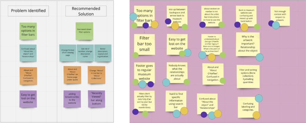
After user testing was complete, as a team, we compiled the usability issues encountered across all of our participants for analysis. We were able to organize all of our data into session notes outlinings how each user interacted with the website for a given task.
We then consolidated the data containing the list of problems and observed the ones that overlapped. We outlined the ones that either needed the most attention or the ones that were easy to modify accordingly.
Consolidating Data
Implementing Solutions
The Georgia O’Keeffe Museum Collections website offers users a unique opportunity to browse a vast collection of her artwork, personal objects, photographs, books, and records of her correspondences. The participants really enjoyed the ability to use the platform and see all of Georgia O’Keeffe’s items and artworks and how extensive the collection was.
However, there were some key concerns that may have brought confusion to its users and through our recommendations, we aim to rectify the same and provide a more intuitive browsing experience.
Consolidating Data
Recommendation 1
Change in title of “About” to “About the Online Collections”
Problem: Users misinterpreted the “about” section on the navigation bar as a link that led to the biography of Georgia O’Keeffe’s life when the about section links to a page that highlights instructions on how to use this collection website.
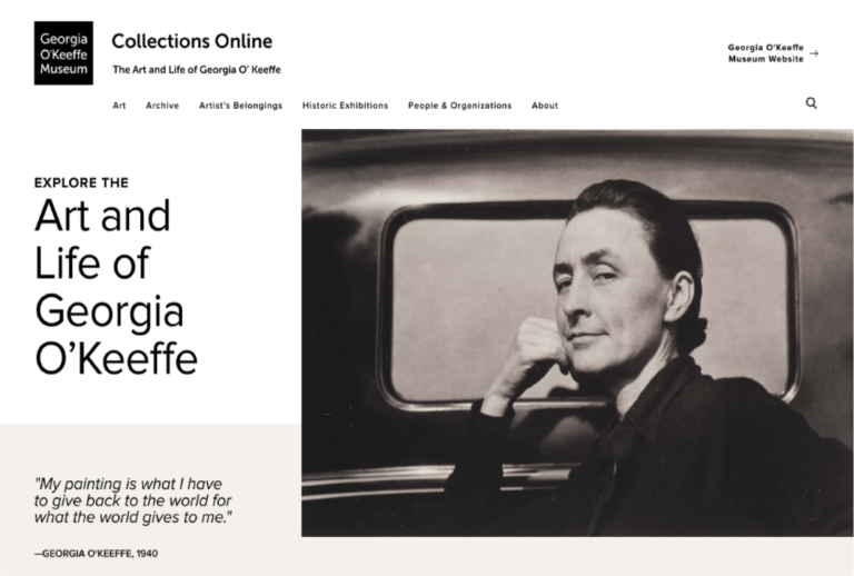
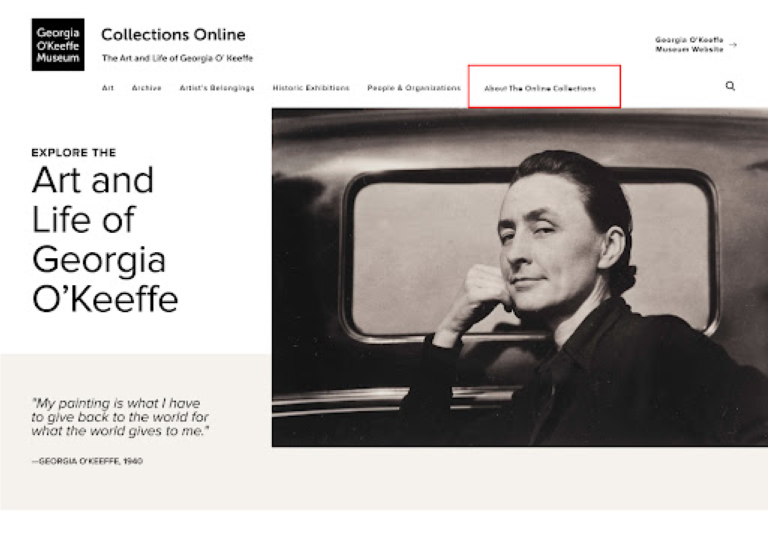
Our recommended solution is to change at the title to “About” to “About the Online Collections”.
Consolidating Data
Recommendation 2
Filter function has too many options leaving users confused.
Problem: Too many options in the filter bar for “materials” which the users had to click through in order to find a specific painting.
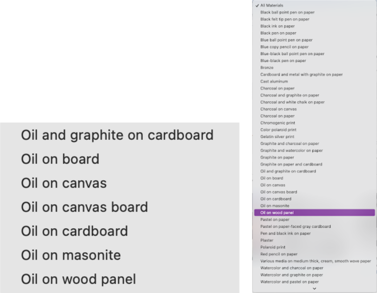
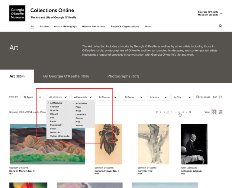
Our recommended solution is categorizing the filter into materials and medium to condense and organize the options.
Consolidating Data
Recommendation 3
Reorganization of the artwork page for users to better understand relationships.
Problem: Many of our users found it difficult to read and understand the specific artwork page. It was overwhelming for them and there was a lot of unnecessary text being displayed. Four of our users were wondering why there were two different tabs being displayed under the artwork piece.
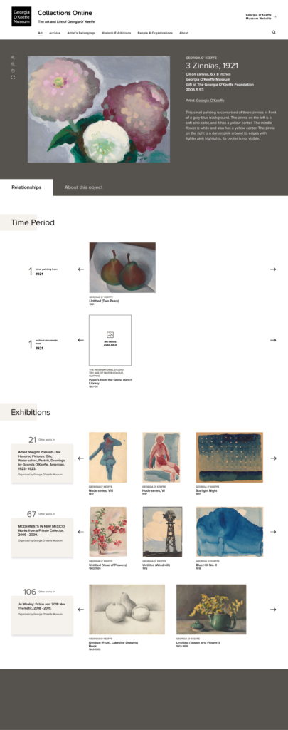
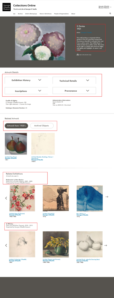
Our recommended solution is to place only the image description beside the artwork.
Condense the artwork and technical details into dropdown options.
Add filters to “Related Artwork” so the user can access information as needed.
Change in title of “Exhibitions” to “Related Exhibits” giving a subheading. Providing a description along with it so as to give readers context about the artwork being displayed in the following exhibits.
Consolidating Data
Recommendation 4
Adding An Accessibility Feature To The Artwork Page.
Problem: Several participants had a difficult time reading and finding information.
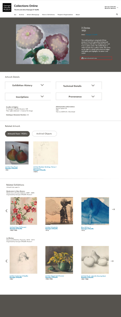
Our recommended solution is to add an accessibility feature as 25% our users were 55 and older. This will help them listen to the artwork’s story without them having to face issues while reading.
Consolidating Data
Recommendation 5
Introduce a “Recently Viewed” bar and “Saved Items” feature to keep track of viewing history.
Problem: Reaccessing information found in previous tasks in the research scenario, which affects how the collections website can be used as a research resource.

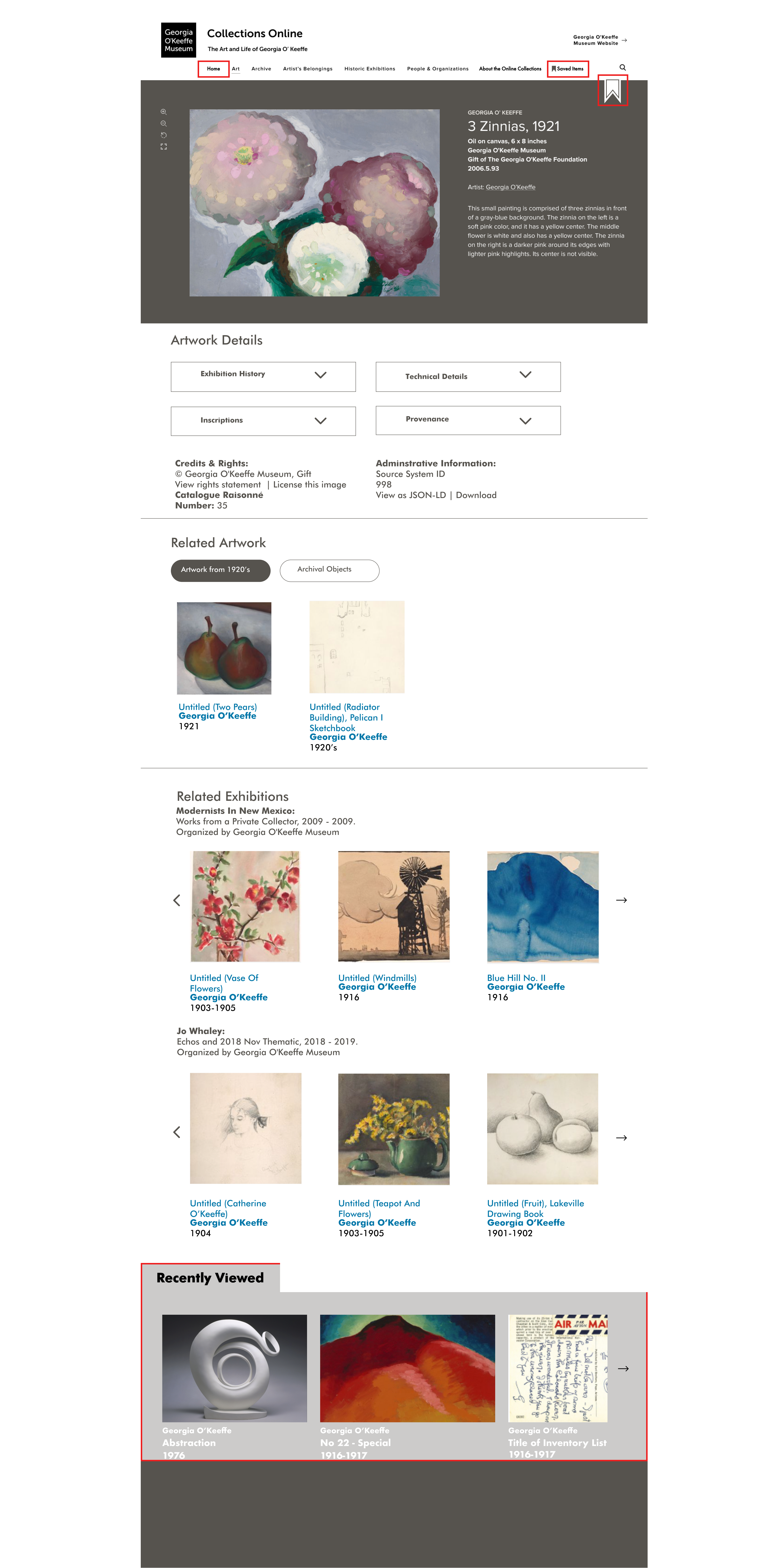
Our recommended solution is adding a new feature that displays recently viewed items along the bottom of the page, and a bookmark feature that allows to view saved items.
Deliver Presentation
Client Feedback
“The idea that relationships is not descriptive enough is interesting too.”
Throughout the course of the project , our team made sure that Georgia O’Keeffe’s legacy between her artwork and self is reflected as that what is important to our client when discussed in the kick-off meetings. Having to hear those very words made us feel successful in our efforts as that is exactly what we strived for right through designing our tasks and implementing our solutions.
“It’s really good information and suggestions.”
No greater joy than the client agreeing to your suggestions and wanting to implement them hence making this usability study a successful one!